For established firms, freelance professionals, and students just starting out, today’s portfolio needs to be more than just the simple presentation of past work. The portfolio has to be a representation of aesthetic, vision, and personality — it has to tell the story of who this person is and all of what they can accomplish.
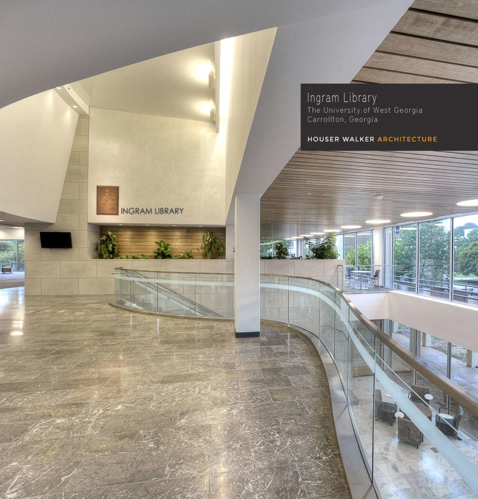
“Creating a great portfolio today requires a very different approach than previous times,” says Gregory Walker, principle at Houser Walker Architecture firm of Atlanta. “We’re always looking to communicate the stories of how a design solution emerged over time,” he says, “how the final solution communicates the designer’s intent and also the client’s needs.”
A Blurb book by Houser Walker
With advances in print-on-demand through companies like Blurb, the portfolio can now be precisely tailored to meet individual needs, while also maintaining an unmatched level of quality. For firms like Houser Walker, and a wide range of professionals, this advanced new format means a more nimble, economical, and scalable way of telling their stories.
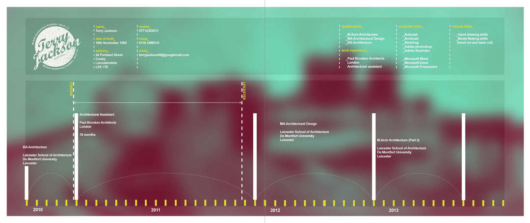
“When I think of a traditional architecture portfolio, I immediately think of oversized leather folders full of clear plastic wallets and work,” says recent graduate of the Leicester School of Architecture in England, Terry Jackson. For many students like Jackson and freelance professionals seeking work, the constraints of a traditional portfolio confine and reduce their accomplishments.
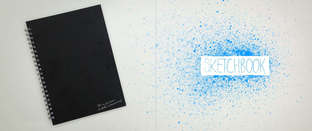
Blurb book by Terry Jackson
As a student with interest and experience in photography, fashion, graphic design, illustration, and typography, Jackson needed a portfolio that would speak to the full range of his potential. He needed a way to showcase his dynamic passion for anything related to art and design. “I wanted mine to stand out, and to be unique to me,” he says.
The competitive nature of the current job market demands just that, and for Jackson, the traditional portfolio meant that a lot of what made him unique simply wouldn’t fit. “It came down to cost, convenience, and layout,” he says. Even 50 pages of work in a traditional portfolio can be cumbersome and expensive, so finding the space to collect all of his work while also staying true to his own design was, “… something that was never going to work ‘traditionally’,” he says, “No matter what I did … it would never look professional and never did the work I’d spent the past year on any justice at all.”
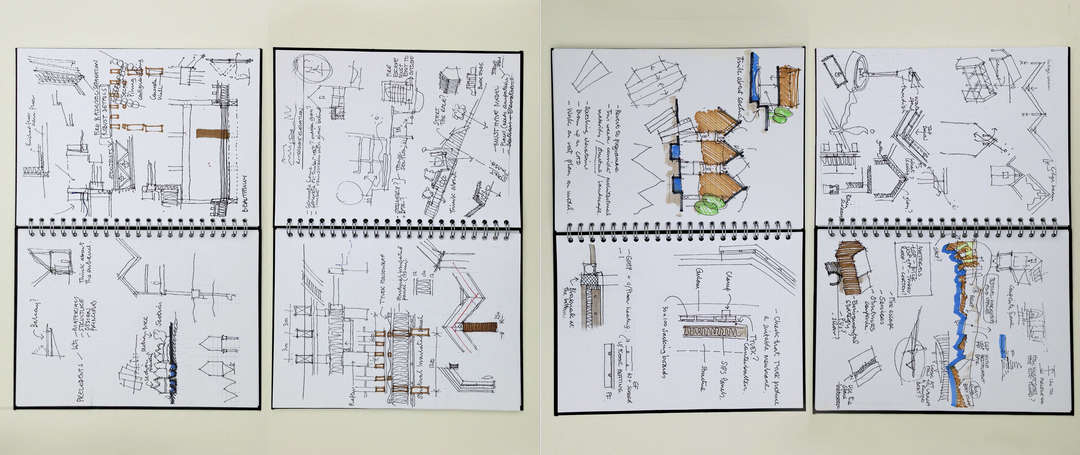
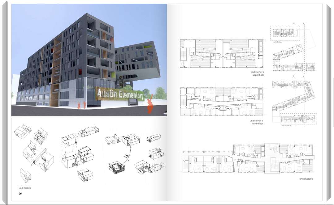
Inside Terry Jackson’s Blurb book
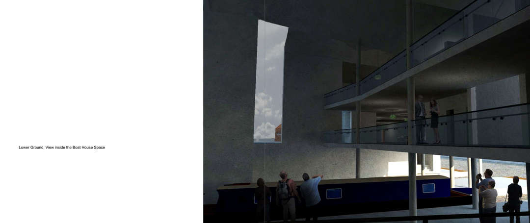
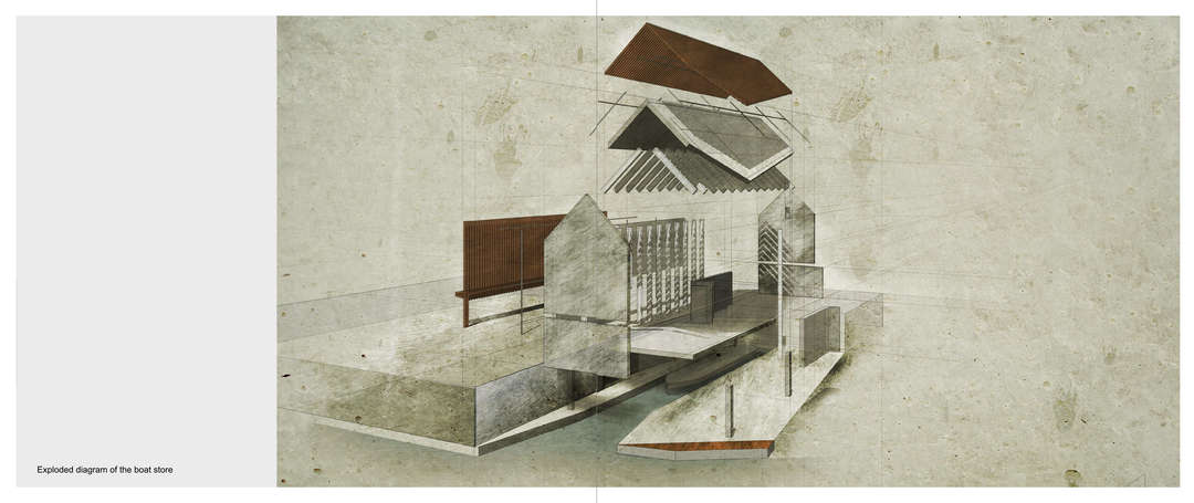
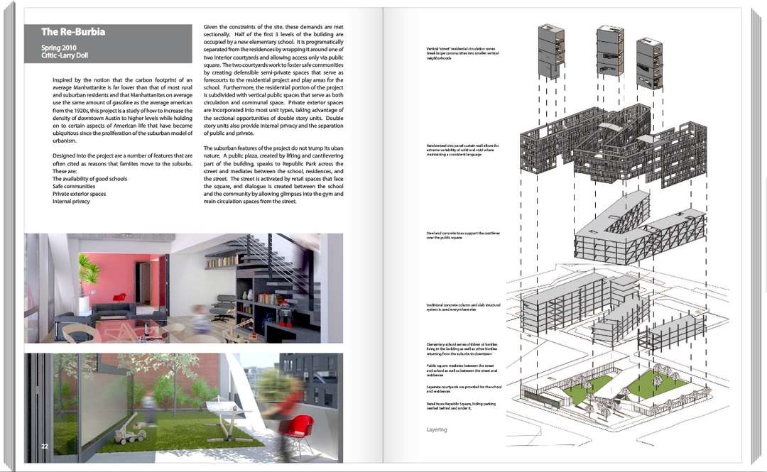
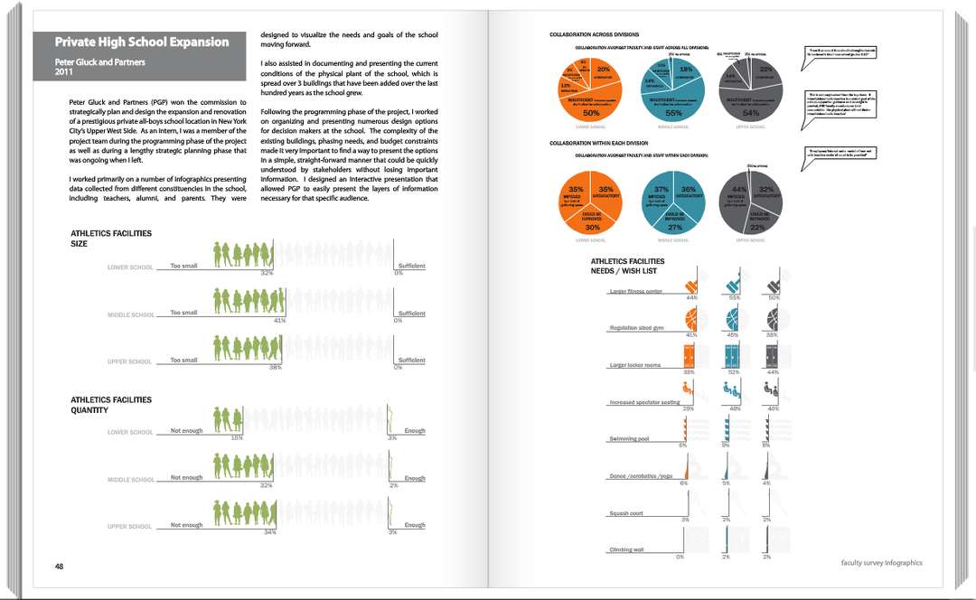
Jackson used Blurb’s tools to create an impressive 234-page landscape book, with each page reflecting a unique facet of his interests as well as his process, all the way from inception to completion. Blurb books gave him the freedom to arrange as many images and texts as desired, as well as the advantage of affordably printing anywhere from one to ten thousand copies.
Inside Terry Jackson’s Blurb book
For Jackson, this meant he could have a physical book that encompassed everything he wanted, without paying the price for large-scale publishing. Having a complete, professional quality book at just the right size has proven convenient for presenting his work, but it also provided a source of accomplishment and confidence. “Books can be special and sentimental,” Jackson says, “There is nothing more special than seeing all your hard work and efforts created into your very own book.”
Inside Ross Galloway’s Blurb book
For architect Ross Galloway, currently with GLUCK+ in New York City, the cost and design limitations of a traditional portfolio were also obstacles after completing his Master of Architecture at The University of Texas at Austin. “Print shops can be expensive unless you order a lot of books, especially if you want something perfect bound. I didn’t need a lot of books since I could only apply to so many places and I knew my portfolio is a living project that I will continue to update with new work,” Galloway says. Blurb’s services cater to this unique aspect of the professional portfolio. As a career advances, their print-on-demand makes it easy to recreate and update without major costs and inconveniences. Blurb books easily unfold and evolve along with the designers who create them.
Inside Ross Galloway’s Blurb book
Blurb also helps their authors get the exact look and feel they want. “My first portfolios before the blurb ones were a little scattered and cluttered … I wanted the portfolio to be simple, clean, present the work first, but also feel like it was as designed as the work. ” Galloway says. Blurb’s tools allow authors to pull from programs as varied as InDesign or Instagram, while still maintaining total control over the composition of the final product. This freedom also opens up the potential for innovation in what a portfolio should and can be.
Inside Ross Galloway’s Blurb book
“We’ve found that focusing on a select group of individual projects and telling richer stories about their evolution has a greater resonance than a brief overview showing dozens of projects in snapshot form,” says Walker of Houser Walker Architects. Their firm uses Blurb to create project-specific “records,” professional-grade publications that commemorate the history of each project in an attractive, functional way for both current and potential clients.
Having this capability to turn professional presentations into physical books, and even narratives, makes them more memorable and helps architects and designers to better communicate what they’re capable of. For their special “records,” Walker says, “We wanted these to feel as close to a traditional ‘book’ as possible — high quality reproductions and papers, cloth covers, hardback, etc. Quite literally, Blurb was the best platform we could find short of a full publishing house to accomplish our goals.”


