When it comes to living spaces, ‘bigger’ has long been synonymous with ‘better’. But times are changing. In Paris and London, micro-living is gaining momentum due to ever-increasing housing prices. Outside of the city, people choose to live in smaller spaces as well, with the tiny house movement swiftly growing in popularity. Here, living small isn’t driven by necessity, but by a desire to declutter and live in a simpler, more minimal and ecologically friendly way. But how can you fit life into a restricted space and still create a sense of personality and expanse?
SMALL YET LUXURIOUS
Smaller living can be luxurious. There’s a growing realisation that having a big house can be cumbersome. The more space you have, the more useless stuff you collect, the more you have to clean, and the more energy you use. Big isn’t necessarily beautiful, either. There is a subtle loveliness in minimalist efficiency that grandeur can never achieve. But how can you make a tiny space beautiful in your own, unique way?
To answer that question, Quick-Step turned to Tiny Houses in Belgium. This company, led by Arno Geunes, designs and constructs mobile wooden cabins for people that dream of a less cluttered and more sustainable way of living.

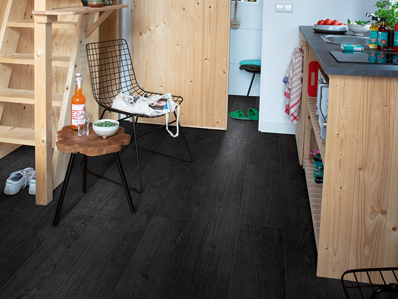
Impressive Burnt Planks Laminate Flooring, £23.99 per square metre, Quick-Step.
THE BEAUTY OF EFFICIENCY
Arno: “Every tiny house is another challenge, as you need to optimise the use of limited space to meet the need of every inhabitant. What are their needs? What will their daily life look like? What compromises are they willing to make? You really need to get down to the gritty details of every action, even those as simple as entering and leaving the house, doing the laundry, and washing up. This often results in ingenious, surprising, one-of-a-kind solutions, like single pieces of furniture that serve multiple purposes. A stair step that also functions as a table or a hidden storage, a pulley bed that can be winched up into the ceiling when not in use, etc. These things create a unique sense of beauty, as the space becomes a direct reflection of the inhabitant’s personality.”
CREATING A SENSE OF SPACE
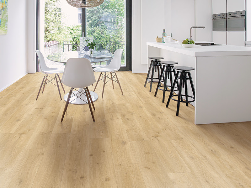
Arno spends a lot of thought on creating a sense of space despite the smallness of the room. “One important thing people tend to forget but which plays an important role in the functionality and overall feel of the room is the floor. Since the same space serves multiple purposes, you’ll need an easily maintainable floor that is stain-, scratch-, and water resistant. Laminate and vinyl are great options. But, a floor can greatly change the sense of space in your room as well. I tend to use lighter, cooler tones in my designs because they create a feeling of openness.
Grains and knots should be subtle as well to ensure that the floor doesn’t look too busy. When it comes to installation, placing the planks parallel to the longest wall of the house helps create the illusion of a larger room.”
“Apart from that, I mostly opt for a few big windows, instead of multiple smaller ones. Adding mirrors is also a neat trick. For the most part, we try to make optimum use of the walls, for example, by using hanging shelves and cupboards. This frees up floor space. A neutral, limited color palette for your walls will make your space feel less visually overwhelming. Add some subtle patterns and textures to keep the space from looking bland.”
HOW TO MAKE SMALL ROOMS FEEL BIGGER
Even if you’re drawn to a minimal lifestyle and ready to deal with restricted surface area, most people love to have a sense of space. Here are some tips for making a room seem larger than it actually is.

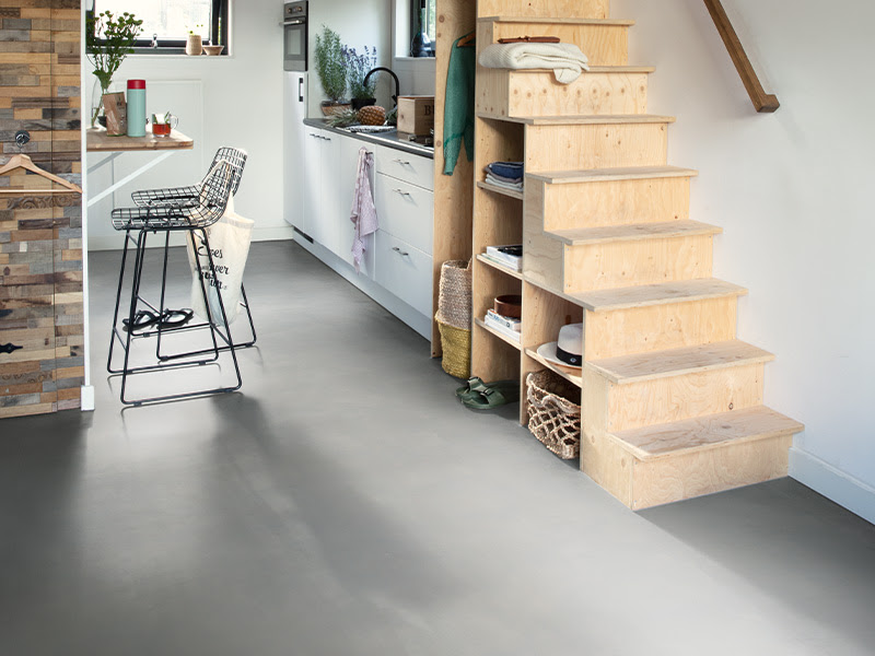
Ambient Minimal Light Grey Luxury Vinyl Click Flooring, £31.99 per square metre, Quick-Step.
1. Colours
Different colours give different impressions of depth. Warm colours, for example, tend to pop out and advance, and thus make a room look smaller. Use light, cool tones on your walls, furniture, or floor to create a more expansive space. Contrary to popular belief, dark floors are allowed as well – as long as you balance them with lighter tones.
Keep the contrast low, however. Medium or light shades for your floor should be complemented with similar hues for your walls. This eliminates the ‘horizon line’ and creates the illusion of an expansive space.
2. Flooring design
In a small space, subtle is better. Avoid excessively grained wood species and big differences between planks. This would make the room seem very busy. Use the same flooring throughout the entire space as well.
3. Floor plank size
The size of your flooring planks should be proportional to the size of your room. That being said, however, be aware that narrower planks will make the room look busier and wider planks will make it look cleaner. Make sure you get the balance just right.
4. Plank direction
The direction in which you install your floor planks is key. If your room is rectangular, you can expand the space visually by placing the planks parallel to the longest wall. Make sure to float the floor in the same direction throughout all of the rooms to create a cohesive feel. Does your room have lots of natural light? See if you can run the boards along the axis of the light, so the joints are less noticable. An interesting alternative is to install the planks diagonally. It directs the eye outward and can create a more expansive feel.
5. Expose the floor
Think vertically. Take advantage of empty walls and install hanging shelves and cupboards to expose the floor.
For further information, visit www.quick-step.co.uk
