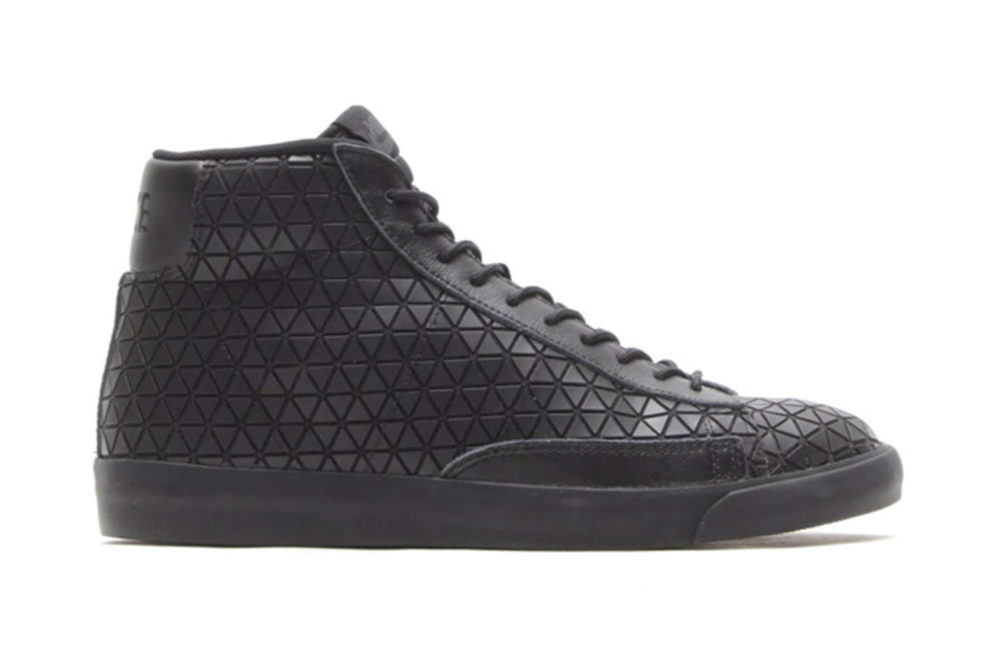
If Louis Kahn wore Nikes, they would probably look something like this. The newly released Blazer Mid Metric shoe displays a slick monohedral tessellation reminiscent of the ceiling at the American architect’s iconic Yale University Art Gallery, and their obsidian coloring also syncs perfectly with the oldest of industry clichés: “I’m an architect. I will wear black until something darker comes out.”
Naturally, I prefer function over form, in all walks of life — but not all architects see the world this way. Here are six more shoe designs that wouldn’t look out of place in a gallery, on visitors’ feet if not on plinths. Would you be seen wearing any of them?
Via Miss Owl
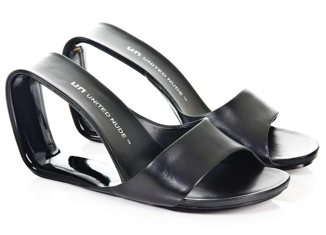
Möbius | Rem D. Koolhaas
Not to be confused with his brand-name uncle, Rem D. Koolhaas heads up the design department atUnited Nude. The Möbius was created “by transforming the frame of Mies van de Rohe’s Barcelona chair into a single band uniting the upper, sole, foot-bed and heel into one infinite piece.” That’s right, it’s a shoe inspired by a chair designed by an architect.
Via 74 FDC
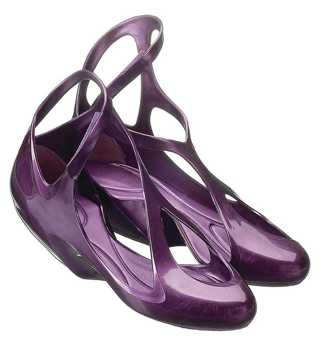
Melissa | Zaha Hadid
Zaha Hadid has designed a number of shoes over the years, but the Melissa sticks in the memory for its close resemblance to many of her buildings. The sinuous curves synonymous with ZHA’s brand of parametric architecture arguably look more at home in the realm of product design, but the jury is out on the ergonomics of this amorphous pair of heels. Commenters on Dezeen are typically polarized: Some have lauded the molded plastic design, while others were less complimentary, summing them up in three words: “Crocs on LSD”.
Via Pentacom
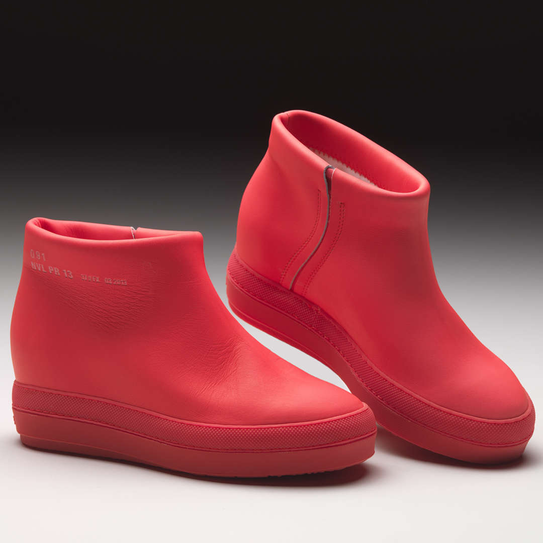
Pure | Jean Nouvel
Made for Italian shoe brand Ruco Line, Jean Nouvel’s leather and rubber boots reduce the concept of a shoe to its purest form, according to the French architect. This may be the product that most closely adheres to the “form follows function” hypothesis, with lashings of futurism added for good measure. I’m not sure I would be taken seriously if I arrived at a meeting with a client wearing that color, though…
Via Dezeen
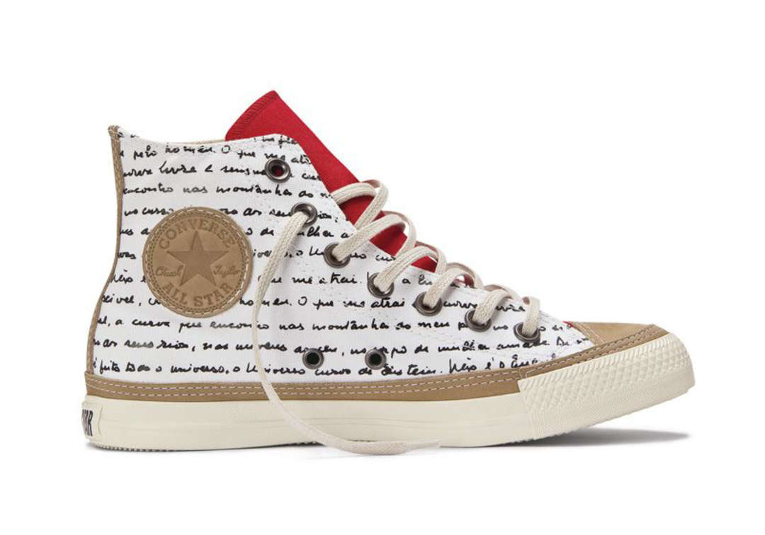
Oscar Niemeyer Collection | Converse
These weren’t designed by an architect, but they were inspired by one. To celebrate the fact that the birth of their company correlates with that of Oscar Niemeyer, Converse wrapped these special edition sneakers with handwritten notes by the Brazilian icon. Furthermore, the bold red tongue is a reference to the distinctive entrance to Niemeyer’s famous Ibirapuera Auditorium in São Paulo. [Ed. Note: These, unfortunately, are superficial in a way that Niemeyer’s work decidedly is not.]
Via Julian Hakes
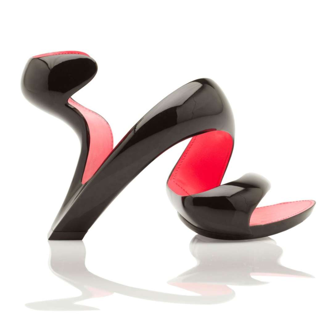
Mojito | Julian Hakes
Like Rem’s Möbius shoe, the high heel designed by architect Julian Hake is comprised of a single strip of structural material — but the Mojito is markedly more flamboyant, spiraling from ankle to toe with no footplate required. The design was revised from its original form to address practical issues, and has perhaps lost some of its purity in the process, but it remains a brave exhibition of reductive design nonetheless.
Via Web Urbanist
Boots | Frank Gehry
Who would have guessed that boots designed by the king of titanium waves, Frank Gehry, would turn out to be so… conventional? The Canadian architect justified his foray into footwear design as follows: “Architects create brand names now; it’s useful to commercial industry to associate with those names in the same way they do with movie stars. We’re going back to the renaissance model, in which artists could work in any discipline.”
Just don’t mention the fact that he may have stolen the look from Michael Jackson’s video for Smooth Criminal…

