Lighting has the ability to transform a project and how it’s experienced more than you may realize, particularly when it’s used to highlight vertical surfaces and ornaments. Consider, for a moment, what the New York City skyline would be like at night without the recognizable beacon that is the Empire State Building’s crown. The building’s changing lighting schemes, some of which observe holidays and current events, have become as iconic as the Art Deco skyscraper itself. Lighting is such a specialized and important aspect of design that there’s an entire profession dedicated to it separate from architecture, interior design and landscape architecture. Whether you’re working with a lighting designer or not, you should know some basics about illuminating walls and other elements to create impact. Read on for some fundamentals and advice.
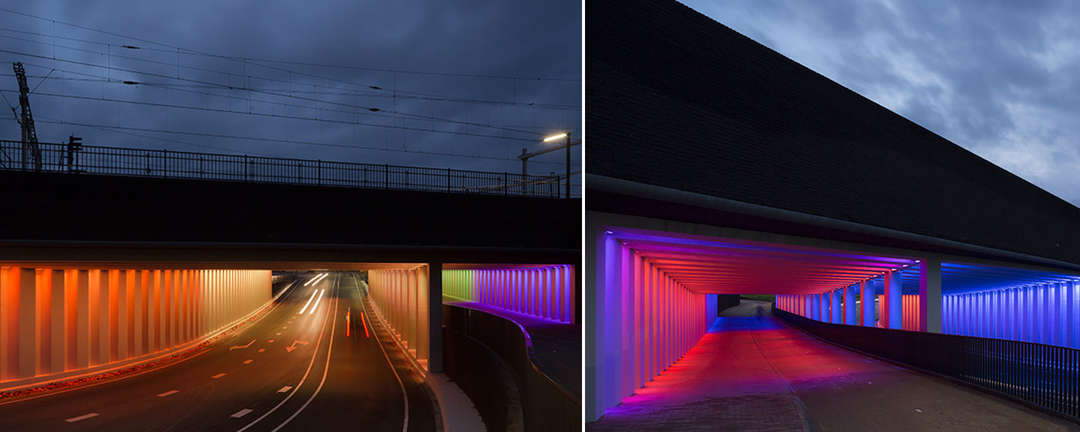
Tunnels in Zutphen, the Netherlands, lit by designer Herman Kuijer; photography by Jannes Linders
Washing Versus Grazing
Washing typically gives large surface areas a glow as well as a smooth and even appearance. The fixtures need to be positioned farther from the plane they’re illuminating to minimize shadows, which will help mask mistakes on the surface.
“The use of wall washing also makes a room or space feel larger,” says Jim McCarthy, senior market specialist for lighting manufacturer Eaton. He advises, “Light from above the surface should be evenly spaced. Recessed downlights or surface-mounted products installed on the ceiling plane are appropriate solutions to create this effect. Specification sheets from manufacturers will give the height, distance and spacing that will achieve the optimum effect with the needed luminance levels.”
Grazing, on the other hand, is a dramatic effect used to emphasize surface texture and create a focal point. “When wall grazing, luminaires are moved closer to the wall causing the light to hit the wall at a tighter angle. The distance the luminaire is positioned from the wall will determine the amount of shadowing and textural effect,” explains McCarthy. “This wonderful effect will also make statues and carved elements come alive by adding more dimension. Stage lighting uses this technique to make objects appear more life-like.” The effect can additionally be achieved with in-ground or floor lights.
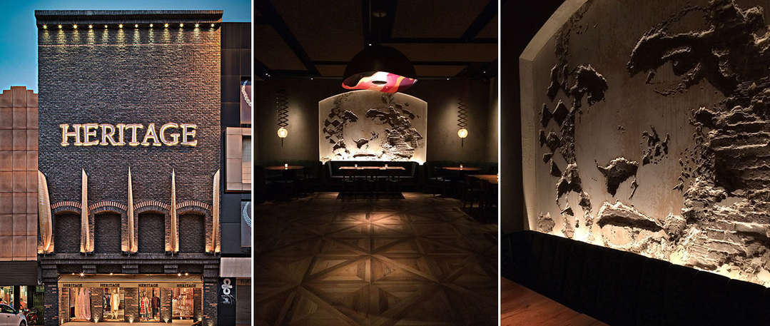
From left: Heritage boutique in India by RMDK Architects; a site-specific installation by artist Vhils at the Rockwell Group-designed Vandal in New York City; Vandal photography by Sheila Kim
Why Do Either?
As mentioned earlier, washing or grazing can significantly enhance a façade or interior, aesthetically. Both techniques mostly create focal points or ambience or showcase architectural materials. Allison Hunter, a senior associate at Horton Lees Brogden Lighting Design, adds, “From an interior perspective, we try to balance daylight coming in through windows with artificial light to increase visual comfort. Reflected light from a surface also functions as a light source in a space. With regards to exterior, we’re asked a lot to form an identity for a building, whether it’s lighting the top of a tower so people can see it from a distance to signage that’s low to the ground. It’s a way to identify and give personality to a building.”
She cautions, however, that more isn’t more, meaning if you light every surface within a single project, nothing is special anymore. “It’s strategically picking the elements that you want to light in order to create an experience for everybody.”
Uplighting Versus Downlighting
If you’re going to wash or graze walls, you’re likely going to specify up- or down-light systems. But before you settle on one or the other, there are a couple things to think about. Uplighting tends to “spill” light into the atmosphere (picture New York City’s glow), which in some communities is frowned upon because it deprives people of a night sky. Downlighting, on the flip side, could potentially create disability glare. However, there are numerous louvers and other glare-control products on the market to rectify such issues.
Both techniques have the potential to result in light “trespass,” which means the light extends to another site or property — causing discomfort for neighboring tenants or residents. Close attention to beam spreads and angles will help solve many of these problems. One great option is to work with in-ground fixtures. When used with the correct optics for the application, in-ground lights can achieve most effects with fewer glare and spillage issues.
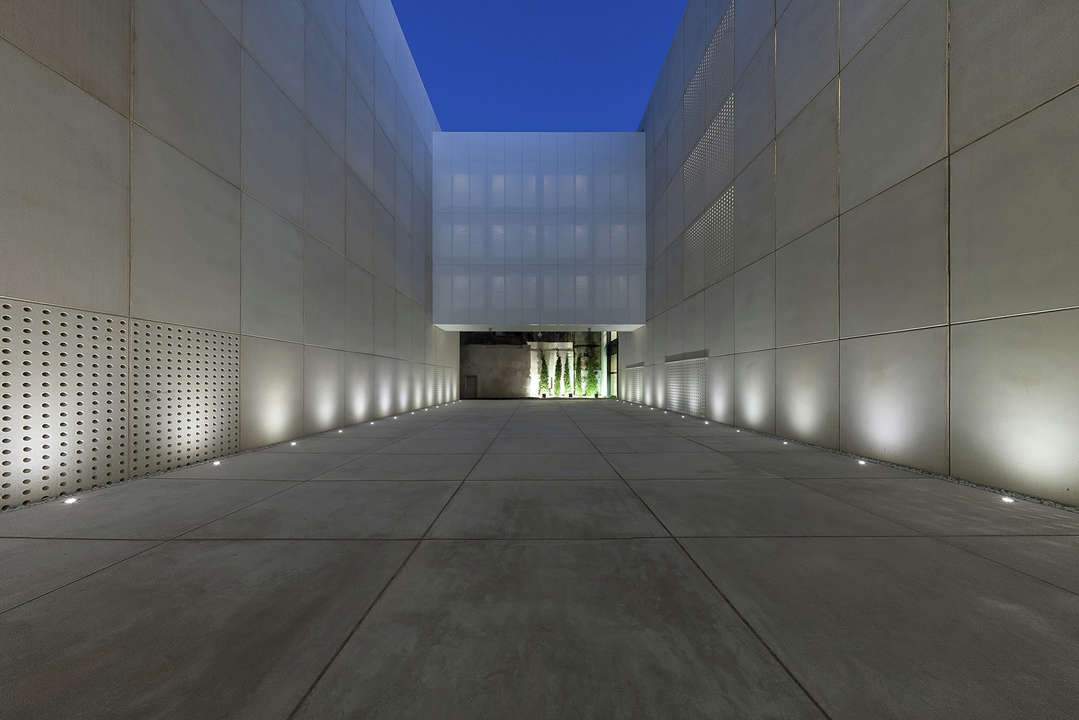
Archive of the Kingdom of Mallorca in Spain by Estudio de Arquitectura Hand; photo by Adolfo Gosálvez
Avoid These Two Big Mistakes
You’ve perfected your hyperrealistic renderings, showing exactly how cornices will be grazed and domes washed. The client is in awe when seeing the light effects rendered and approves your design. The problem arises when you’re deep into the project, before involving a lighting designer, and he or she tells you that the lighting effects either cannot or should not be done the way you envisioned. “Realistic rendering is a wonderful tool but can also be dangerous,” says Hunter. “Your computer program may create an effect that’s not necessarily impossible but not practical in reality.” Bring in the lighting designer as early as possible in the process.
Another mistake that Hunter observes is project teams “not knowing the aspects of the materials that they’re lighting.” She continues: “I tell them to mock it up. If you’re debating back-painted glass versus something else, get a sample, get a fixture and see how the light interacts with the material.” Also, architects sometimes change the material midway without communicating this change to the lighting designer.
Reducing Energy Use
The most obvious solution to reducing energy consumption is turning to LED sources, especially if the lighting is for exteriors in moderate to cool regions — because LEDs inherently like the cold. Attempt to avoid light spillage or pollution by choosing fixtures with just the right optics to hit only the surfaces they were intended for. (Along the same lines but more about comfort, be sure to prevent exterior lighting glare for passersby in cars or on the sidewalks.)
And finally, consider timed control systems to extinguish the lights during off-peak hours. “You’ll notice that the Empire State Building shuts off at two in the morning,” says Hunter. “That’s a way to minimize light pollution but still achieve a dramatic effect.”

