Red is a dramatic color. Always eliciting a strong visceral response, we’ve evolved to become alarmed when we see it, since its oldest association is with the natural hue of blood when it’s outside the body. As such, red has been employed over time as the color of warning signs, stoplights and emergency response, and when used in architecture, it is often in the service of one of these goals.
The importance of this association is not lost on architects who use it discriminately. As evidenced in the projects below, it is exactly these subconscious attributes that make red a popular color to apply liberally in non-emergency settings. Whether helping a project stand out from its surroundings, or as a complement to them, it’s impossible to divorce this color from its deeply reflexive meaning. These projects exhibit a wide range of scale, program and intent, but the attention-grabbing effect is always the same: If you make something red, people will notice.
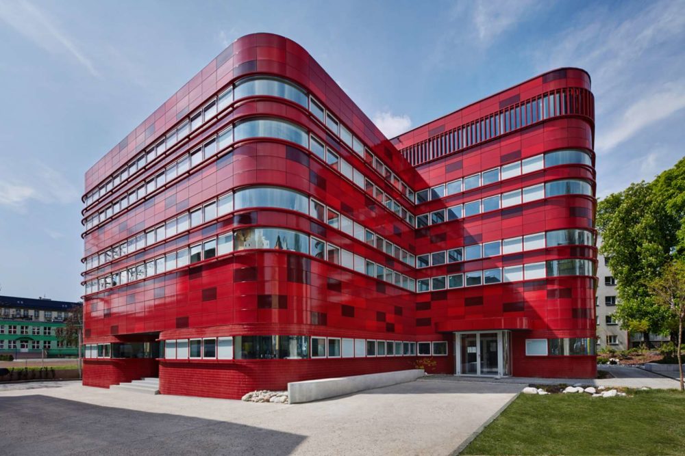
A bold application of red is used not only for obvious associations with this blood donation center, but also to draw attention to its cause. Vivid imagery is conjured up in the use of ceramic panels bathed in a variegated range of deep reds. These panels curve around the building’s corners in an attempt to evoke the biological nature of the substance handled here.
Formal plasticity may be the most noticeable element for this tennis clubhouse, but the bright, single-tone application of red on its exterior enhances this effect. Simultaneously blending in with the courts and popping out from the landscape, this unusual structure serves as an announcement for its ambitious public function: it is open to anyone and everyone, regardless of club affiliation, at any time, year-round.
A temporary, outdoor gallery was housed under this collection of translucent red panels, filtering the summer sun as it shone through from above. Solid expanses of red were placed closer to the ground, their color picked for its contrasting and complementary qualities relative to the lush green of the surrounding park.
A client’s choice mandated the red used on this house, which is thematically opposite to the site’s predominantly cold, northern climate. Placed on a former garden, the color draws attention to this strictly orthogonal structure set within heavily wooded surroundings, highlighting its artificial qualities.
A mobile, deployable architecture is highlighted in red for the use of these canopies, which function as pop-up event spaces. Intended to combat a car-oriented lifestyle by drawing citizens to outdoor public spaces, this choice of color demands an awareness of the cause being supported, and works to underscore the importance of spontaneous face-to-face interactions in an urban context.
Color choice, combined with a unique material articulation, was employed to impart a sense of inspiring lightness on this theater’s guests. A red motif is carried throughout the building on both the exterior and interior, and even affected the design of furnishings, endowing the theater’s more public, non-performance spaces with an entertaining quality.
With a wide exposure facing directly onto a busy highway, the designers of this multi-purpose center employed a long, massive wall to act as a spatial, visual and auditory separation between building occupants and the road. The fact that it’s colored bright red not only reflects the ostentatious goals of the architects, but also unintentionally inspires alertness in drivers passing by.
The deep coloring of traditional stage curtains inspired the choice of red metal panels for the roof of this outdoor amphitheater. Hoisted above both the performance and the audience, this dramatically hued shelter, impossible to miss, provides a balancing counterpoint to the action happening on stage.
A linear expanse of programming is accommodated in this 1,640-foot-long structure, defining the heart of a park along its winding path. Possessing a strong red color throughout ensures that it will be clearly discernible by park-goers. This subtle yet strict image of organization complements its natural surroundings and adds valuable legibility to the public asset it defines.
